Badge
Props
| Prop | Type | Description | Required |
|---|---|---|---|
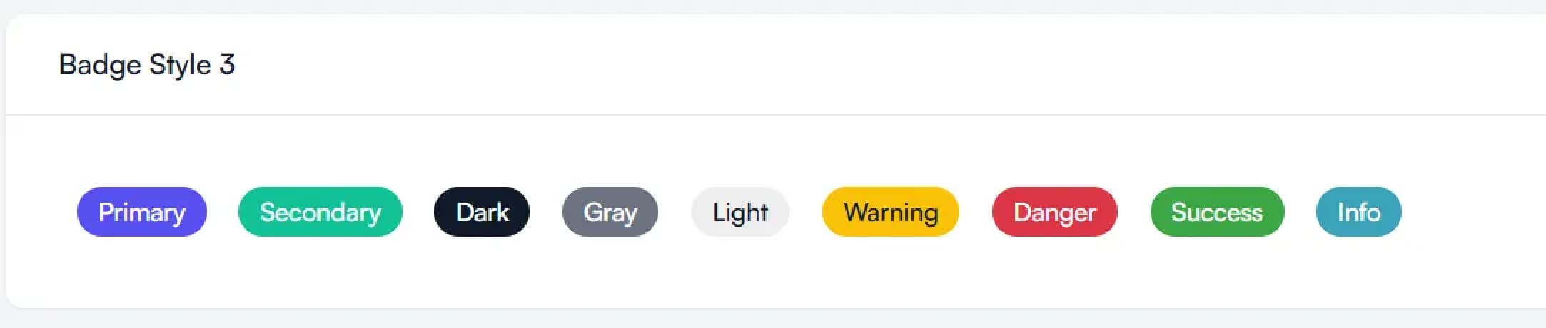
variant | primary, secondary, dark, gray, light, warning, danger, success, info | The style variant for the badge, determines its color and appearance. | No (defaults to primary) |
children | React.ReactNode | The content to be displayed inside the badge. | Yes |
className | string | Additional custom CSS class names to be applied to the badge. | No |