Buttons
Props
| Prop Name | Type | Description | Required |
|---|---|---|---|
label | string | Text content of the button | Yes |
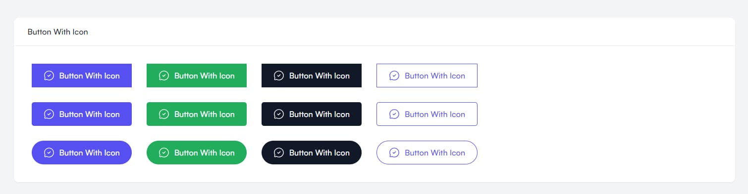
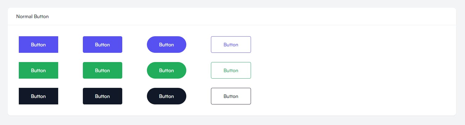
variant | primary, green, dark, outlinePrimary, outlineGreen, outlineDark | Style variant of the button | No |
shape | default, rounded, full | Border radius style of button | No |
size | small | Size of the button | No |
icon | ReactNode | Icon component to display with button text | No |
className | string | Additional CSS classes | No |
Examples
Normal Buttons
Buttons With Icon