Dropdowns
Key Features
- Accessibility:
DropdownTriggerusesaria-expandedandaria-haspopupfor better accessibility.DropdownContentusesrole="menu"for proper semantics.
- Click Outside Handling:
- The
useClickOutsidehook ensures that clicking outside the dropdown closes it automatically.
- The
- Keyboard Support:
Escapekey closes the dropdown.
This component is flexible for various dropdown-based UI designs!
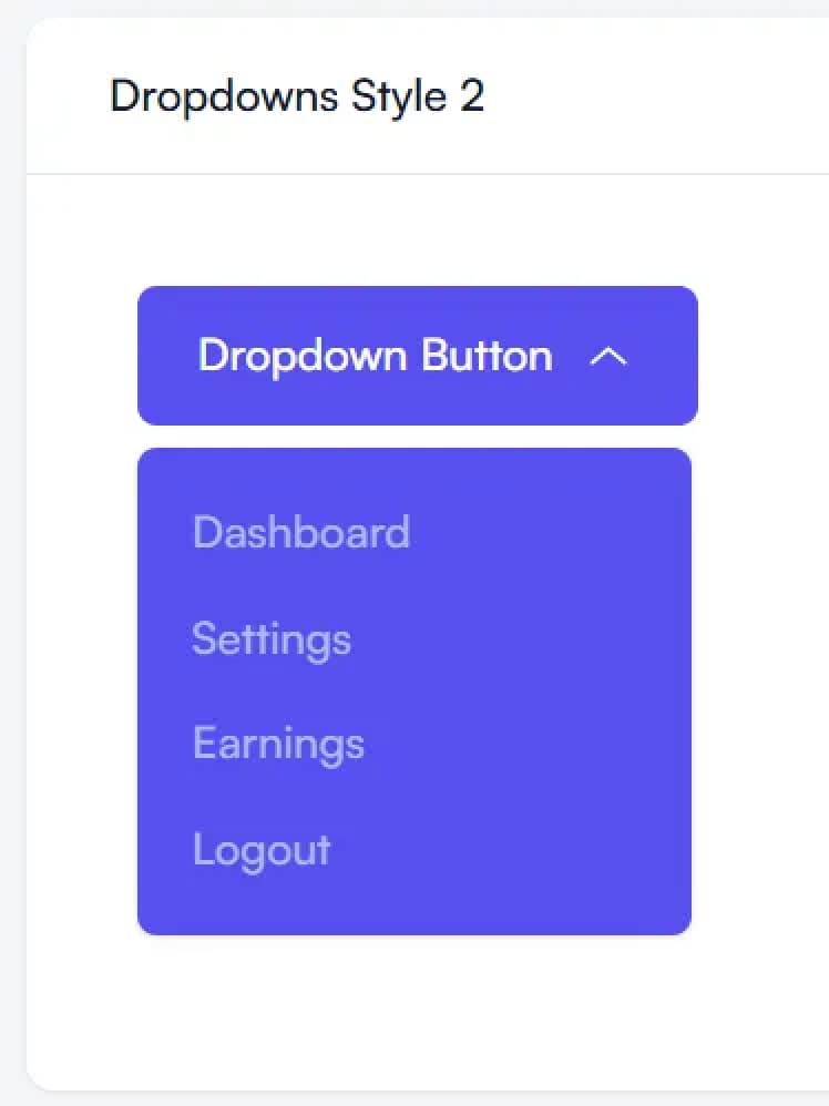
Examples
Props
Dropdown
| Prop | Type | Description | Required |
|---|---|---|---|
children | React.ReactNode | The content of the dropdown, typically DropdownTrigger and DropdownContent components. | Yes |
isOpen | boolean | Controls whether the dropdown is open or closed. | Yes |
setIsOpen | SetStateActionType<boolean> | A function to update the isOpen state. | Yes |
DropdownTrigger
| Prop | Type | Description | Required |
|---|---|---|---|
children | React.ReactNode | The content of the trigger, typically a button or clickable element. | Yes |
className | string | Additional CSS class names for the trigger. | No |
DropdownContent
| Prop | Type | Description | Required |
|---|---|---|---|
align | start, end, center | Specifies the alignment of the dropdown relative to the trigger (start, end, or center). | No (default: center) |
className | string | Additional CSS class names for the dropdown content container. | No |
children | React.ReactNode | The content inside the dropdown (e.g., menu items). | Yes |