Form Elements
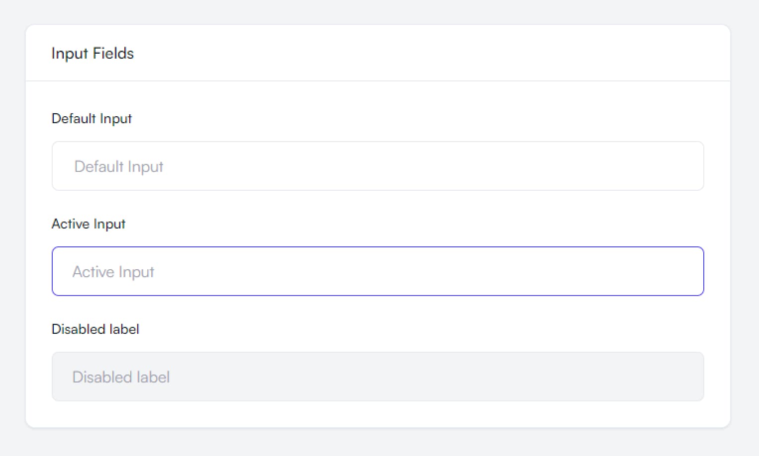
Input Fields
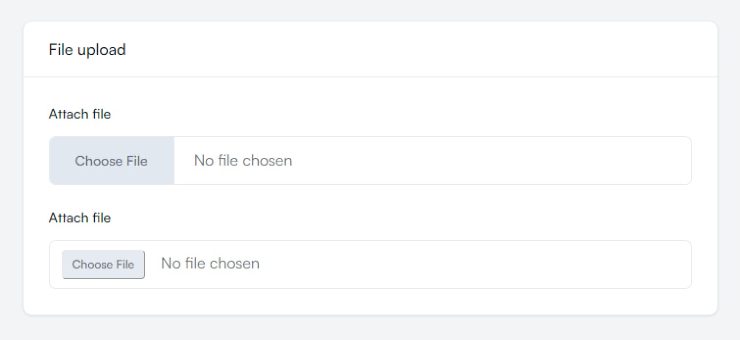
File Inputs
Props
| Prop Name | Type | Required | Description |
|---|---|---|---|
label | string | Yes | Label text for the input field |
placeholder | string | Yes | Placeholder text shown when input is empty |
type | string | No | HTML input type (text, password, file, email, etc.) |
fileStyleVariant | style1, style2 | No | Style variant for file inputs |
active | boolean | No | Whether the input is in active state |
disabled | boolean | No | Whether the input is disabled |
className | string | No | Additional CSS classes to apply |
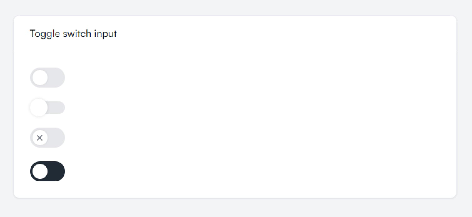
Toggle switch input
Props
| Prop Name | Type | Default | Description |
|---|---|---|---|
backgroundSize | sm, default | "default" | Size of the switch background |
withIcon | boolean | false | Whether to show an icon inside the switch |
background | light, dark | "light" | Background theme of the switch |
className | string | undefined | Additional CSS classes to apply |
checked | boolean | false | Whether the switch is in checked state |
onChange | (checked: boolean) => void | undefined | Callback function when switch state changes |
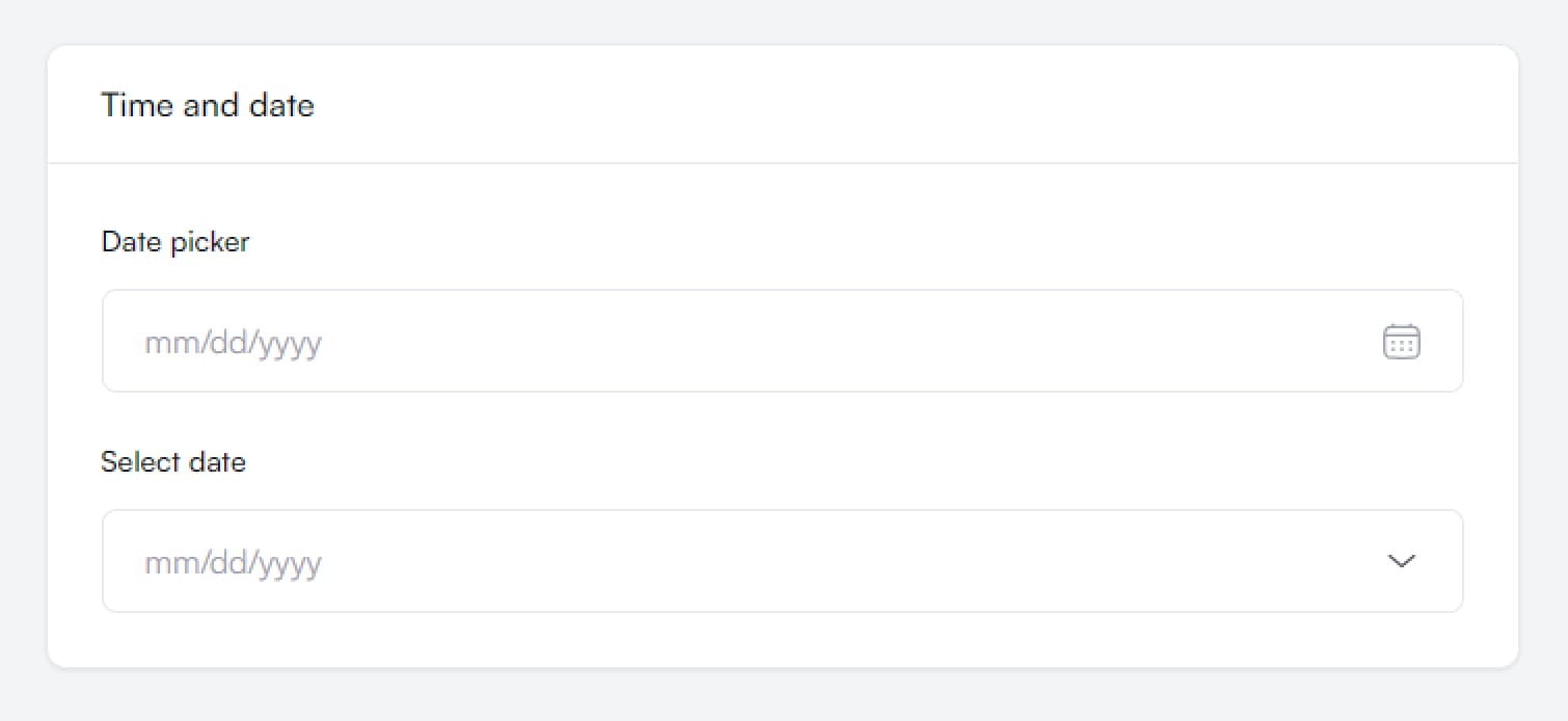
Time and date
Textarea Fields
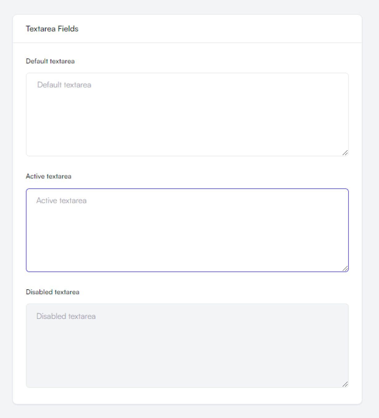
Props
| Prop Name | Type | Required | Description |
|---|---|---|---|
label | string | Yes | Label text for the textarea |
placeholder | string | Yes | Placeholder text shown when textarea is empty |
active | boolean | No | Whether the textarea is in active state |
disabled | boolean | No | Whether the textarea is disabled |
className | string | No | Additional CSS classes for the wrapper |
rows | number | No | Number of visible text lines |
icon | React.ReactNode | No | Optional icon component to display within the textarea. |
Checkbox and radio
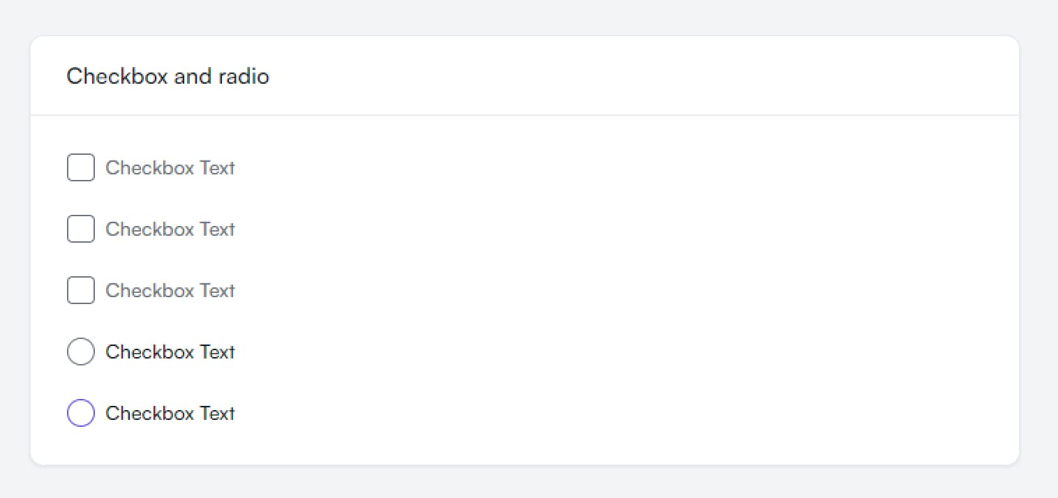
Props
Checkbox:
| Prop Name | Type | Required | Description |
|---|---|---|---|
label | string | No | Label text for the checkbox |
withIcon | check, x | No | Type of icon to display in checkbox |
className | string | No | Additional CSS classes to apply |
minimal | boolean | No | Changes appearance |
onChange | (e) => void | No | Handler function called when checkbox state changes |
radius | default, md | No | Controls the border radius of the checkbox |
Radio Input:
| Prop Name | Type | Required | Description |
|---|---|---|---|
label | string | No | Label text for the radio input |
variant | default, circle | No | Visual style variant of the radio input |
name | string | No | Name attribute for the radio input group |
className | string | No | Additional CSS classes to apply |
Select input
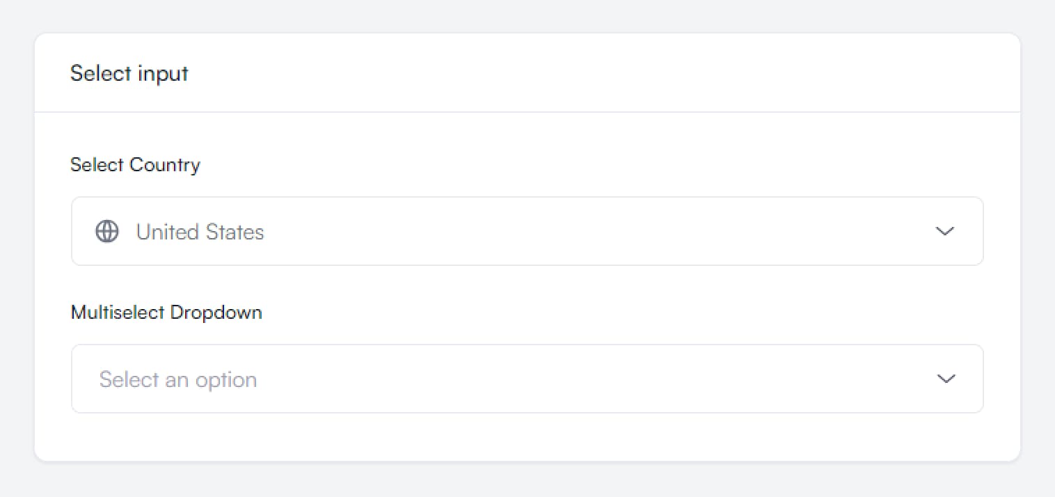
Props
| Prop Name | Type | Required | Description |
|---|---|---|---|
label | string | Yes | Label text for the select input |
items | Array<{ value: string; label: string }> | Yes | Array of options for the select input |
prefixIcon | React.ReactNode | No | Icon to display before the select input |
className | string | No | Additional CSS classes to apply |
defaultValue | string | No* | Initial selected value (*Required if placeholder not provided) |
placeholder | string | No* | Placeholder text (*Required if defaultValue not provided) |