Popover
Key Features
- Accessibility:
- Implements ARIA attributes for improved screen reader support.
- Automatically handles focus and keyboard navigation.
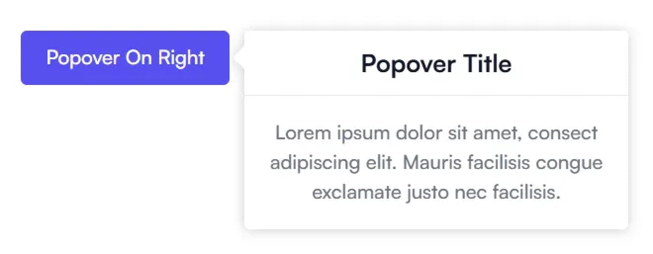
- Customizable Positioning:
- Supports
top,bottom,left, andrightpositions for the popover content. - The
Indicatordynamically adjusts to align with the trigger.
- Supports
- Click outside or press
Escapeto close - Flexible styling
Examples
Props
| Prop Name | Type | Required | Description |
|---|---|---|---|
title | string | Yes | The title text to display in the popover |
description | string | Yes | The description/content text of the popover |
triggerLabel | string | Yes | The text to display on the trigger button |
position | top, right, bottom, left | Yes | The position where the popover will appear relative to the trigger |
Popover
| Prop | Type | Description | Required |
|---|---|---|---|
children | React.ReactNode | The child components, typically PopoverTrigger and PopoverContent. | Yes |
className | string | Additional CSS class names for styling the container. | No |
PopoverTrigger
| Prop | Type | Description | Required |
|---|---|---|---|
children | React.ReactNode | The content inside the trigger button. | Yes |
onClick | function | Optional custom click handler, combined with state toggling. | No |
className | string | Additional CSS class names for styling the trigger button. | No |
PopoverContent
| Prop | Type | Description | Required |
|---|---|---|---|
position | top, right, bottom, left | Controls the position of the popover content relative to the trigger element. | No |
children | React.ReactNode | The content to display inside the popover. | Yes |
className | string | Additional CSS class names for styling the popover container. | No |
Indicator
| Prop | Type | Description | Required |
|---|---|---|---|
position | top, right, bottom, left | Controls the position of the indicator relative to the trigger element. | No |
Functionality:
- Displays a small arrow to indicate the trigger for the popover.
- Dynamically adjusts the arrow position based on the
positionprop and the trigger element's size.