Tabs
Examples
Props
Tabs
| Prop | Type | Description | Required |
|---|---|---|---|
defaultValue | string | The value of the tab that should be active by default. | Yes |
children | React.ReactNode | The content of the tabs, typically TabList and TabContent components. | Yes |
className | string | Additional CSS class names for the tabs container. | No |
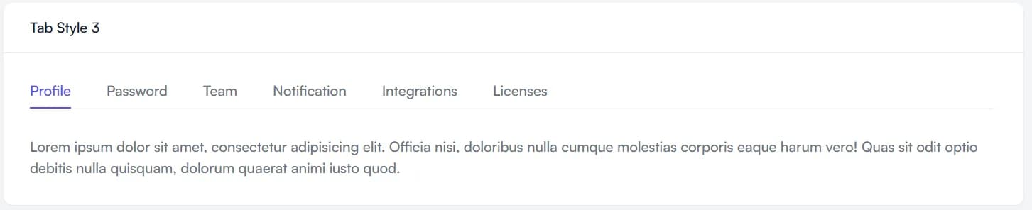
variants | styleOne, styleTwo, styleThree | Determines the style of the tab list and triggers. | Yes |
TabList
| Prop | Type | Description | Required |
|---|---|---|---|
children | React.ReactNode | The list of TabTrigger components. | Yes |
className | string | Additional CSS class names for the tab list container. | No |
TabTrigger
| Prop | Type | Description | Required |
|---|---|---|---|
value | string | A unique identifier for the tab. Used to determine if the tab is active. | Yes |
children | React.ReactNode | The content inside the tab trigger (e.g., text or icons). | Yes |
className | string | Additional CSS class names for the tab trigger. | No |
...props | HTMLAttributes<HTMLButtonElement> | Additional attributes for the <button> element. | No |
TabContent
| Prop | Type | Description | Required |
|---|---|---|---|
value | string | A unique identifier that matches the corresponding TabTrigger's value. | Yes |
children | React.ReactNode | The content to display when this tab is active. | Yes |
className | string | Additional CSS class names for the tab content container. | No |